
Our top tips for choosing your brand’s new colour palette
It probably goes without say, but choosing the right colour palette for your brand is really, really important. It helps people remember your brand and what it stands for. But, picking the right colours can be harder than you think (spoiler alert, it can’t just be all your favourites). There are a lot of things to think about, like what colours mean and who your customers are.
Also, there are also a lot of colours to choose from right?
In this blog post, we'll give you some tips for picking a colour palette that match your brand and are right with your target customers. We'll delve into some key pointers, to get you think a lot more about colour than just how it looks!
Whether you're starting a new brand, refreshing an existing one, or just want to change things up, we’ve got just the tips for you.
What is a brand colour palette?
Let’s start by just clarifying exactly what a colour palette is in terms of branding: A brand's colour palette is a group of colours that are used consistently across all of the brand's marketing materials, from its logo to its website to its advertising. A carefully chosen colour palette helps to establish a brand identity and create a consistent look and feel across all the touch-points. The colours chosen for a brand should reflect its values and messaging, as well as appeal to its target audience.
So now we’re all clear here’s our top tips for choosing your brand’s new colour palette:
Think about colour psychology
As with everything in life, colour is not quite as simple as it seems. Colours have huge emotional values attached to them, they can make us feel a certain way. So when it comes to choosing a colour palette for your brand, it’s important to take a moment to understand colour psychology and how it could impact the colours you choose for your palette.
So what is colour psychology? Colour psychology is the study of how colours affect people's behaviour, emotions, and attitudes. Different colours can evoke different emotional responses and can be associated with certain traits or values. An example is that blue is often associated with trust and professionalism, while red can evoke feelings of passion, excitement but also danger.
With that in mind you’ll want to look at what kind of emotion you want your audience to feel about your brand and see if that aligns with colour choices you are making.
Consider your target audience
Sometimes it’s hard to separate our personal feelings, wants and ideals from that of our target customer. One of the places we see this crops up a lot is within branding design, all too often we can let our personal preferences block our judgement about what our target audience would respond to.
When it comes to choosing a colour palette, whilst you will feel yourself gravitate towards certain tones and hues, you need to pop on your target audience goggles and view it through their eyes.
You might absolutely love the colour red, it’s vibrant and it makes you feel excitement and joy. But to your target audience, who say are eco-conscious, peaceful and live at a slightly slower pace - red will probably not appeal to them. If you want to evoke a calmness, you might look into a soft palette with earthy tones to bring a grounded element.
The lesson here? Always keep your target audience in mind when choosing a colour palette for your brand.
Resist trends, be timeless
We’re filled in an incredible digital world which allows us access to pretty much everything and anything, one particular gold mine is Pinterest. Full of design goodness, you can see all kinds of colour palettes and brand identities on there. It’s just so tempting to take inspiration from things you see on there isn’t it?
When we start a branding project with a client, one of our first steps is to ask the client to pull together a Pinterest board filled with inspiration. Our guidelines have a very handy tip in though… think outside of the box. When looking for inspiration look outside of the type of project you’re working on. What does this mean? It means, if you’re looking to work on your branding, don’t just pin a load of other branding work.
Instead, dig deeper look into other creative areas or passions you have to pull inspirations from. Perhaps this could be architecture, photography or even nature. You’ll find the more closed off you are from trending branding, or colour palettes you are, the easier you’ll find it to create an authentic and timeless colour palette.
Test practicalities
Okay, you’re feeling good about your colour palette? Great! Now it’s time to pick it apart to make sure it’s fully robust. Some practicalities you need to think about include:
Do the colours work for both digital and print? When we design digitally we work in RGB but printed is CYMK - make sure your colour palette is working in both (sometimes CMYK can look a little dull - so may need tweaking!)
Do they work harmoniously? Time to really make sure your colours are working as a team, how many can you seamlessly pair off together, which colours can be used in fonts on which? Are they legible? We swear by Adobe Color for checking harmony!
Are these colours accessible? Most importantly, as a brand or designer, it is your responsibility to make sure your colour palette is accessible and legible, especially on your website. For those with visual impairments we have to make sure colours are up to spec, so that any content can be viewed and read easily. Again, Adobe Color is great for making sure whether you’re colour palette is legible.
Work with a professional
Finding all of the above overwhelming? We get it, choosing a colour palette for your brand is actually a very big job. There’s a lot to consider from your target audience, to colour psychology and even accessibility. That’s why we recommend seeking out a professional to help you with this, after all you’ll still get you input into the process but you can be safely assured that everything else is being checked off.
Here at Studio Pie we help business owners (like you!) to find the perfect colour palette for their project as part of all of our brand packages. Whether you’re looking for the full monty, or a refresh - we’ll help you discover what colour palette speaks to your audience and creates a strong brand identity.
in Summary
So all in all, we’ve learnt that choosing the right colour palette for your brand is important for establishing brand identity and creating a consistent look and feel across all touch-points. You’ll need to consider colour psychology, your target audience, resist trends, test practicalities, and perhaps consider working with a professional.
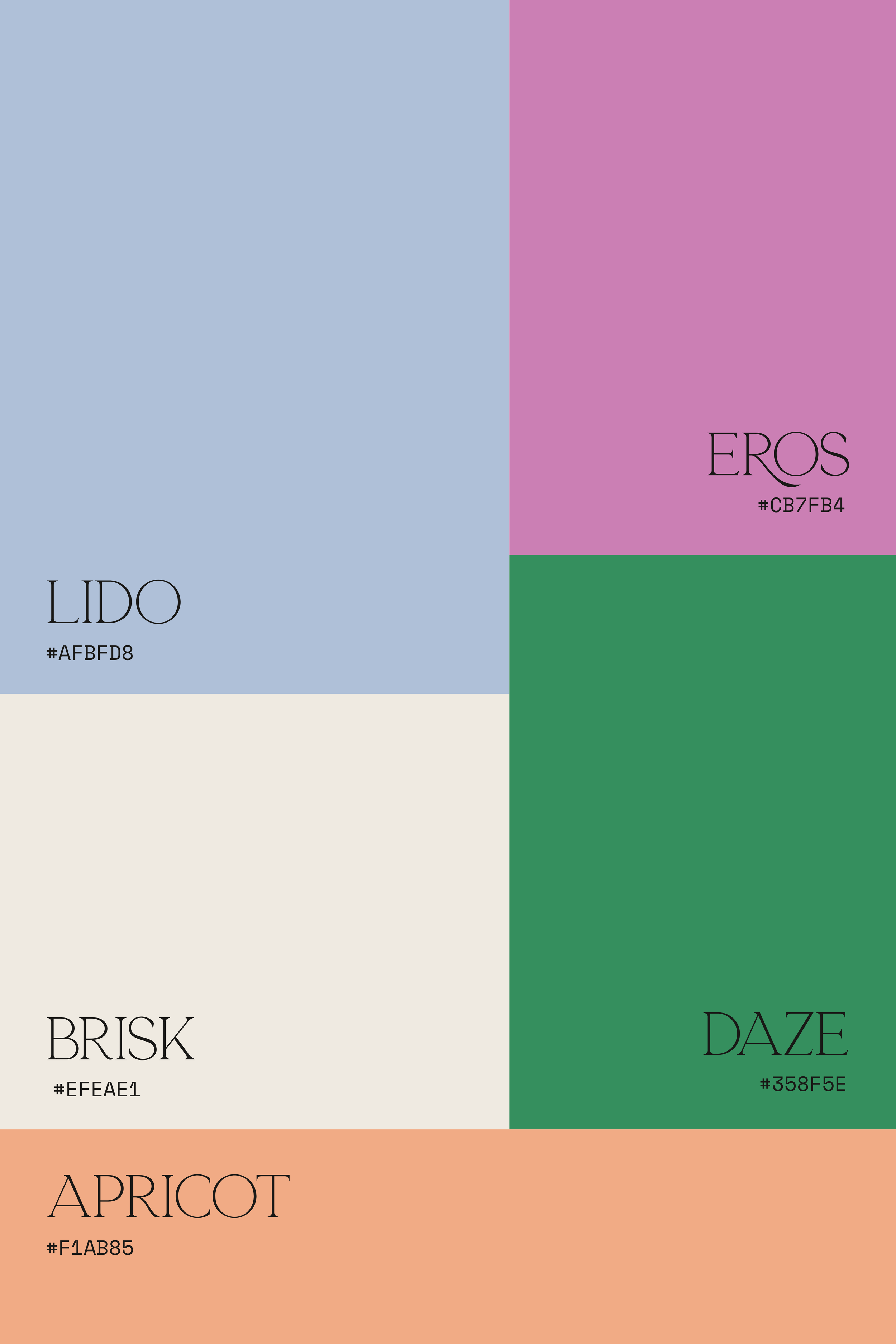
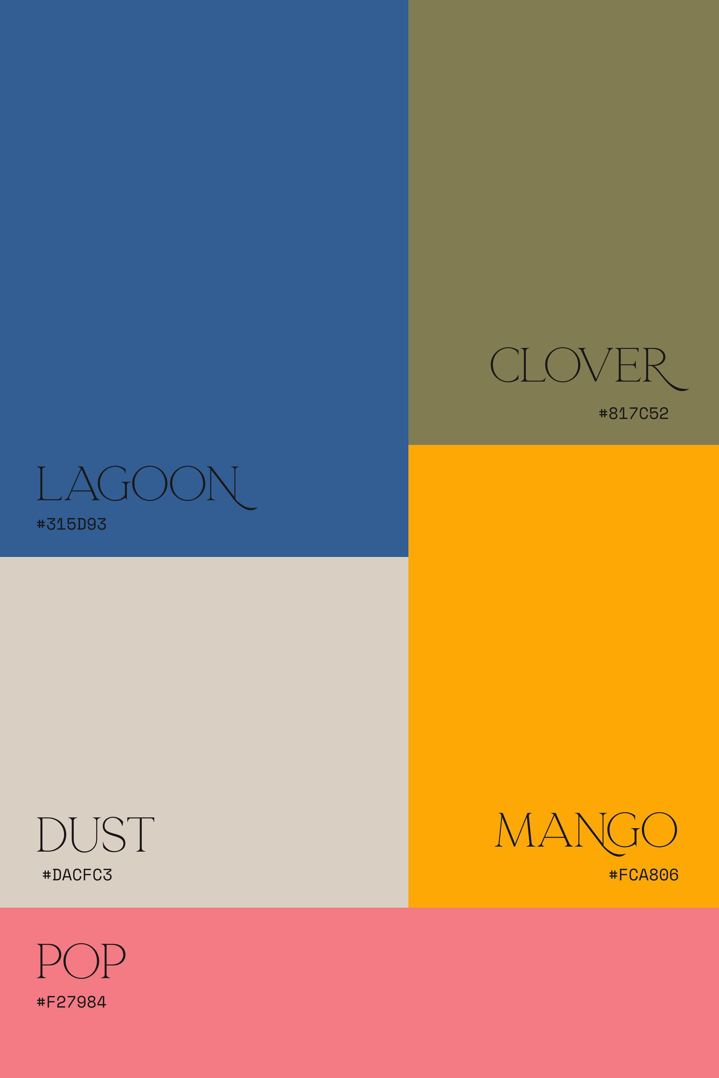
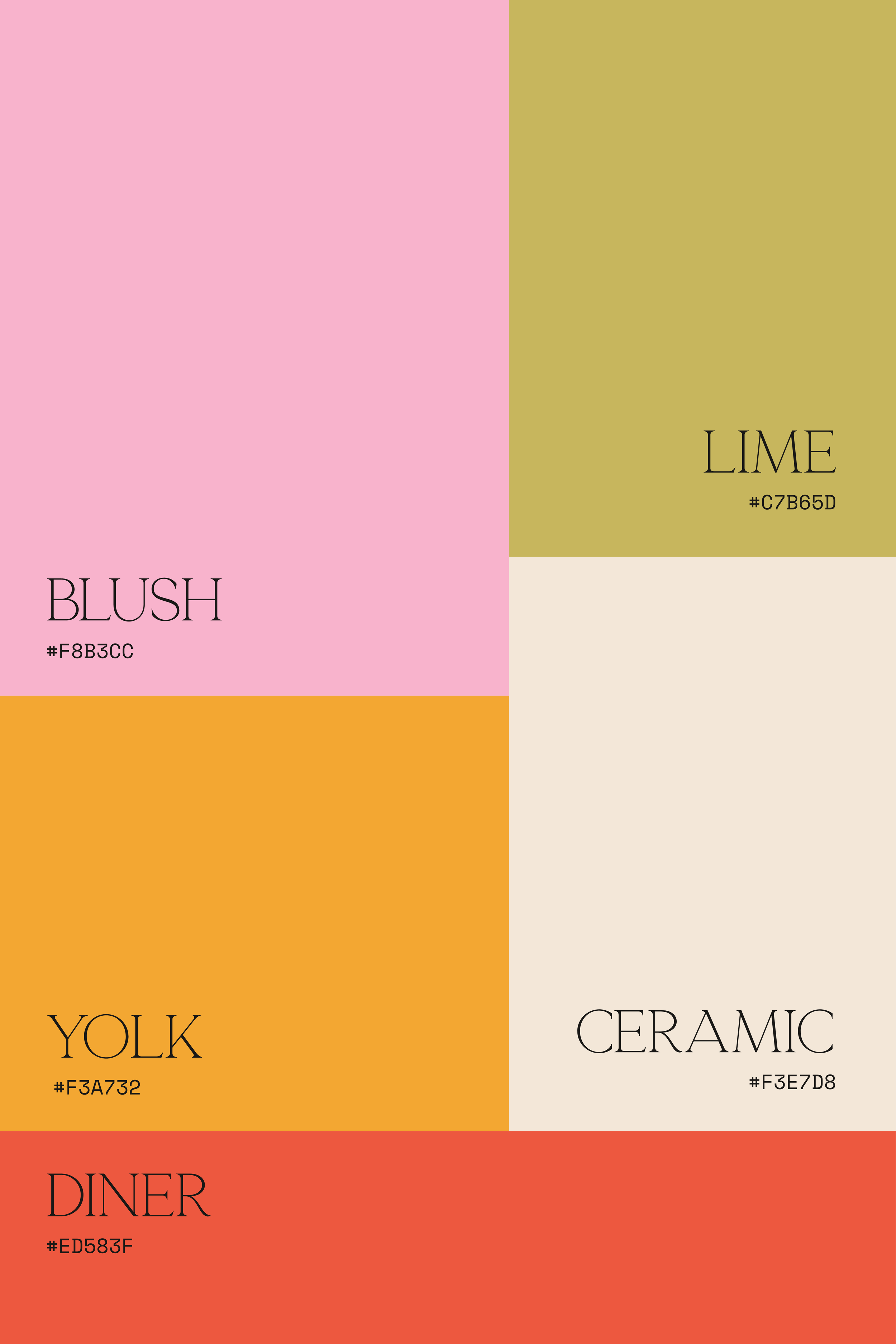
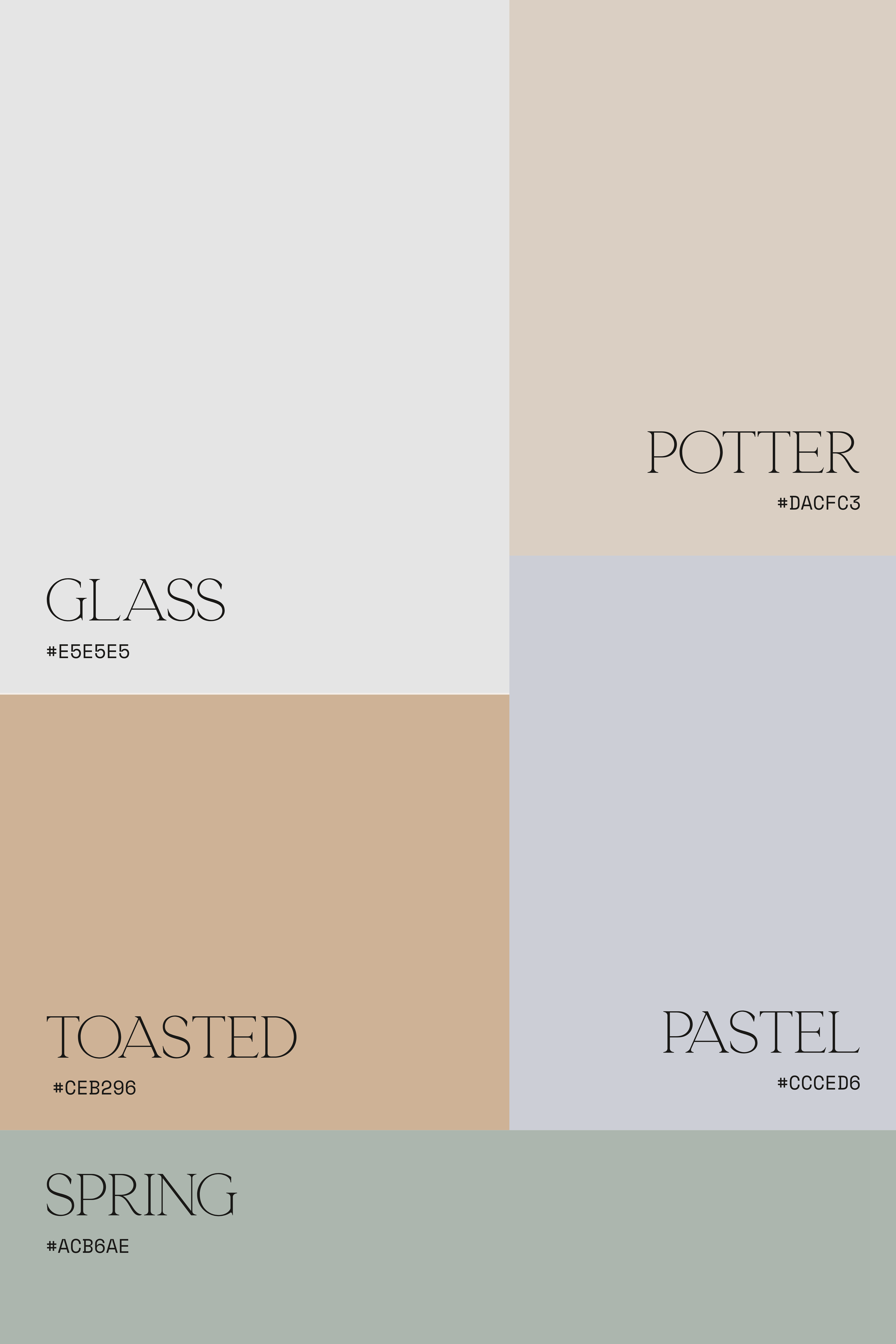
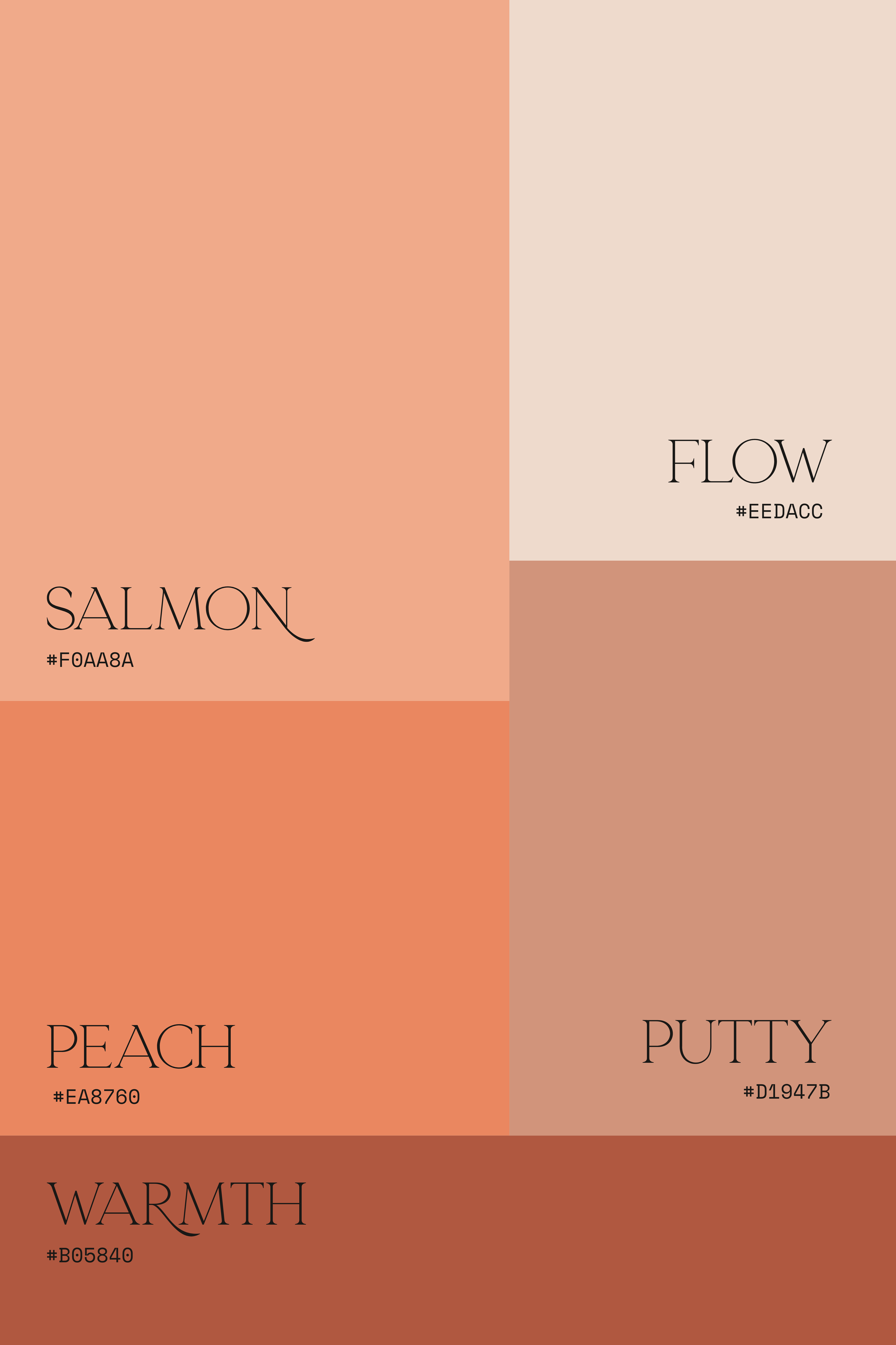
If you’re looking for some colour palette inspiration, head over to our Pinterest Colour Palette board, we update this regularly with some carefully crafted colour palettes!
If you’re looking to update your colour palette, and might need a little help - book into our free 30 minute discovery call to see how we can help you.